
The individual as brand
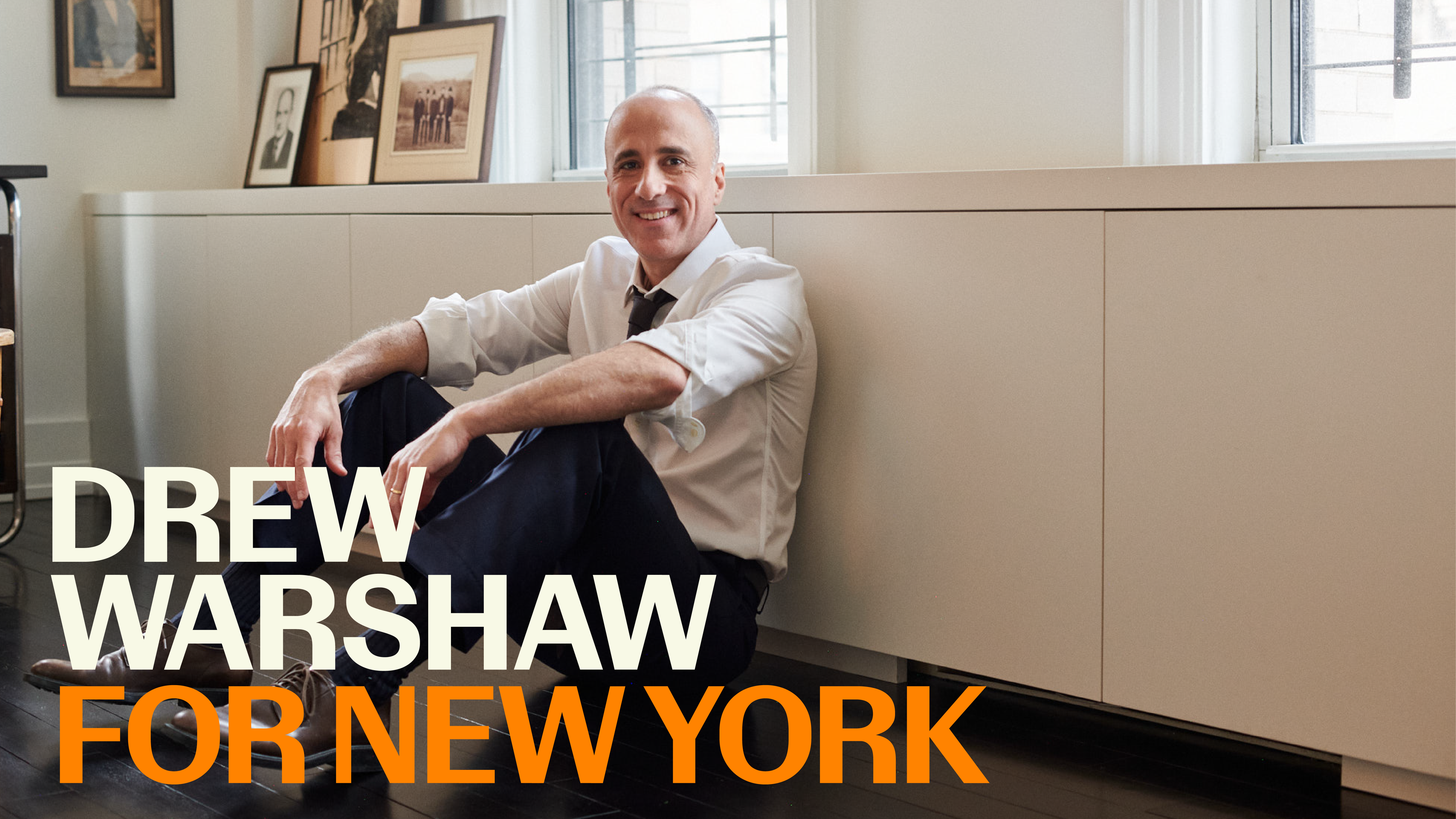
Some of my favorite projects are those that are fueled by honest and passionate principles. Engaged by Shar Biggers, a powerhouse designer in her own right and owner of the agency Saleah, ECS jumped in to this brand project for NY State Comptroller candidate Drew Warshaw.
When a brand is a person’s name, the typography takes on significant and intimate meaning. Everyone is invested in their own name, and my job as a typographer is to reflect them as well as possible.
We were inspired by New York itself—the gritty sparkle of the city as well as the vistas of the New York State’s epic mountain ranges, Atlantic shores and glacial lakes. It’s a diverse place both environmentally and in its populous. So our visual identity needed to capture the spirit and power of New York.
Delivering a whole package
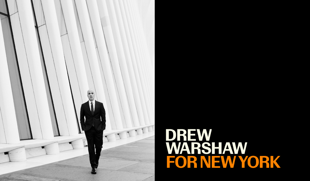
With the official campaign announcement only a few weeks away, ECS built out brand assets for his team, including the identity components (logos in all their necessary contexts), collateral assets, social media assets, and website design. We also art directed a photoshoot with photographer Mikkel Vang to capture Drew on the ground in New York — on the street, in his office, and with his family.
The typography
Every brand has to communicate. Its typography has to maintain the same tone of voice even after we scroll past the logo. That’s what typography does.
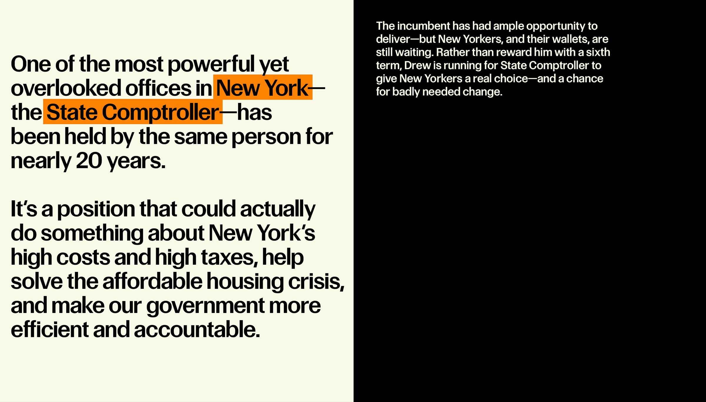
For ECS, a crucial deliverable in any identity project is not just a font file, but demonstrated typography in action. This included designing assets that show how the typography should be deployed. Its scale and placement in context, designed with layered brand colors, is arguably one of the most important parts of maintaining how a brand feels.
We used the typeface Control by Commercial Type—aptly named for this project, of course, but also, the type has a distinct feel, with solid sans-serif, no-nonsense qualities while retaining a ton of character in its contrast and tight spacing.
The results
We delivered an exhaustive list of assets for the team, that all worked in harmony. From the colors through to the art direction, each piece of collateral that communicates Drew’s campaign promises holds together, speaking in a unified voice.