
The finest materials
Tobias Frere-Jones is one of the greatest living type designers, whose work will be used and remembered decades from now. For the 10th anniversary of the foundry’s founding, Tobias and his incredibly talented team commissioned a printed specimen that would display the entire foundry’s catalog in one spot.
One of the reasons I’ve been a loyal user of Frere-Jones fonts all these years is because it’s actually very hard to design something badly when you’re using such good quality typefaces. They’re engineered with such thoughtful precision that typographers—those of us tasked with typesetting—really don’t have to be concerned with the font breaking in disparate contexts.
So in some ways, this was a dream project because I already knew that no matter what I did with the design, the fonts would look great. But in other ways, the pressure to honor this work in the best way I could was intense. They told me I could basically do whatever I wanted. What a dream! But also, how daunting! Wanting to rise to this rare occasion, I worked tirelessly through days, nights, and weekends because I wanted to make something we could all be very proud of. I wanted this piece to endure. I wanted it to feel as special as the fonts themselves.
The format
This project was split into two parts: one specimen to be printed and saddle-stitched in time for the goody bags at the 2025 Typographics conference, and the second as an expanded version, to include two new releases that came out that summer and fall. The first was a 52-page booklet, and the second exceeded 80 pages, which were printed in signatures and Swiss bound, with a wraparound cover that allows the reader to lay the pages flat and to see the sewing of the binding.
To unify the typefaces, I stuck to a strict palette of black, white, and gold metallic ink. Lately I’ve adopted the philosophy that because print objects are relatively rare compared to digitally-marketed pieces, I might as well use colors that you can’t reproduce on a screen. The gold ink has a beautiful, even sheen on the silk paper stock, and its contrast with black ink on white paper was absolutely gorgeous.
The contents
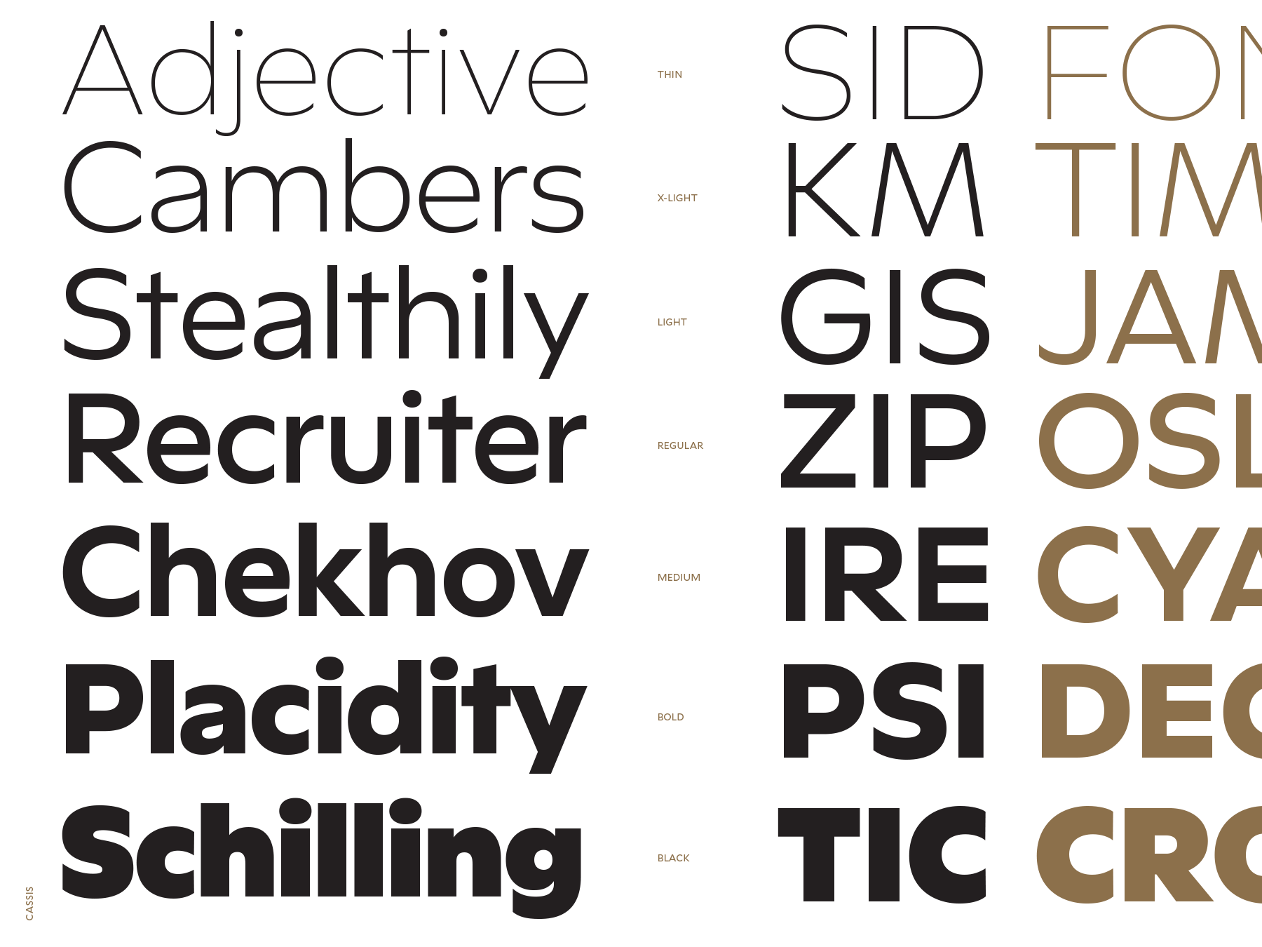
Type specimens were historically the only catalogs available for typographers to see type. Tobias has one of the most coveted collections of historical type specimens, so I got to look through a ton of them to assess waterfalls (strings of words set at different sizes that highlight pretty letters), layouts, and samples of typeset paragraphs. I created a system that allowed each typeface to sing, while adhering to grids that helped the specimen feel like one piece.
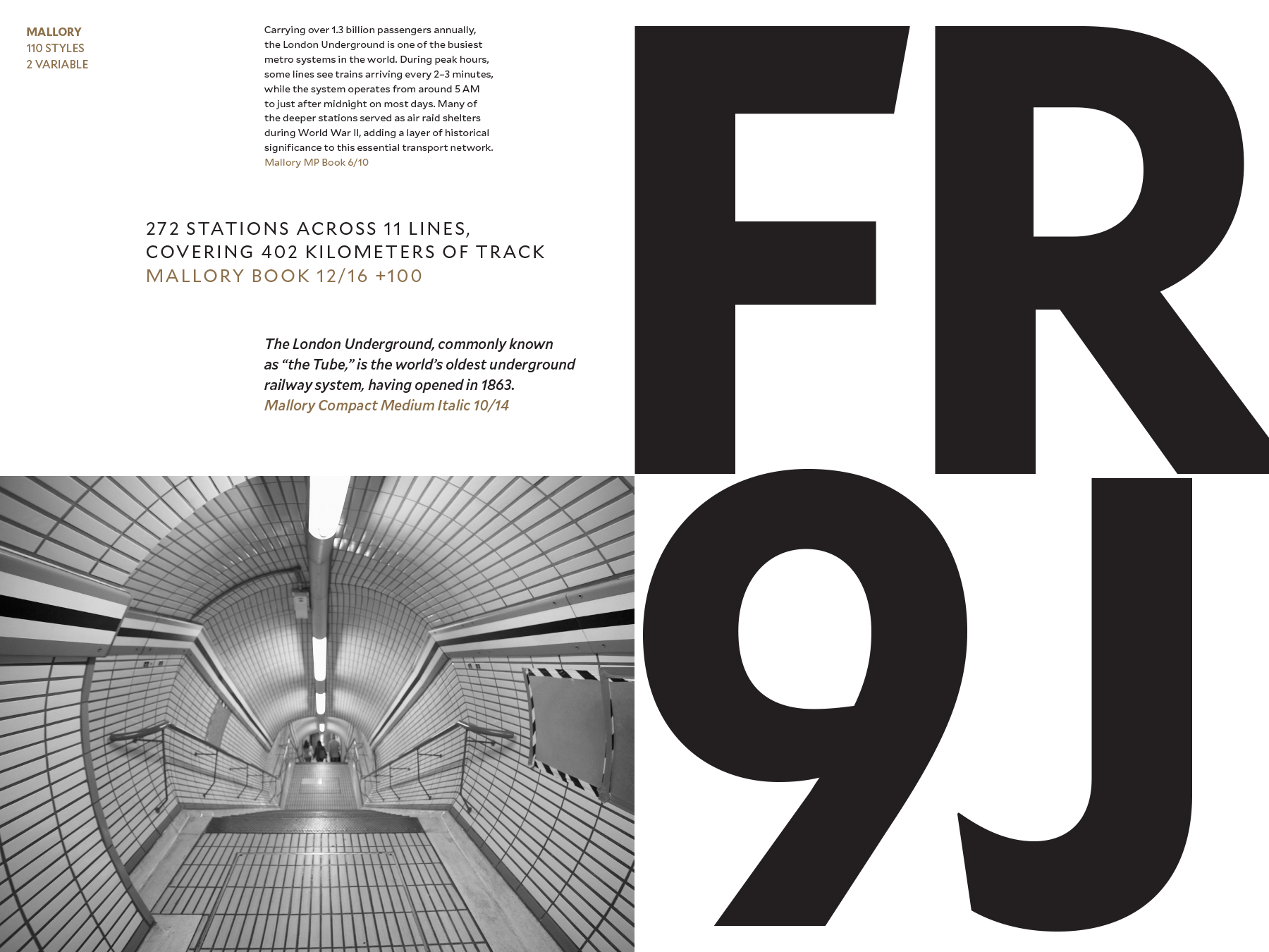
Few specimens include imagery. But as a designer, I rarely use typography that won’t be shown with photography, illustration, or diagrams. I knew that using some photographs would help contextualize the feel of the type, rendering richer spreads that don’t get tedious with too many flat vectors.
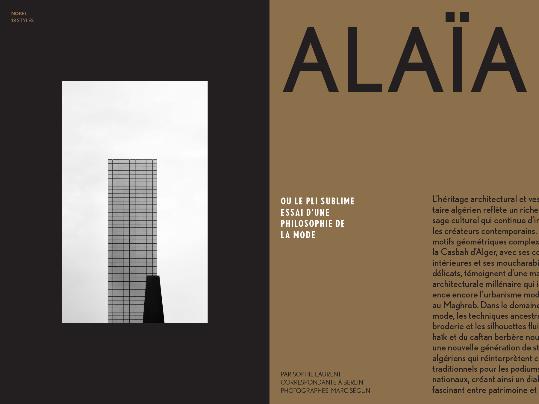
Also important in a typeface specimen: showing language support. Some of the spreads included blocks of text in other languages, to show those unique textures, accents and diacritics crucial to so many scripts.
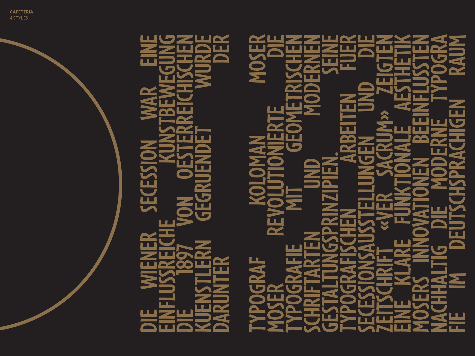
I also played with orientation, with some spreads designed vertically so readers turned the book clockwise like a centerfold. I borrowed conventions from many eras of design, achieving a lively and surprising rhythm throughout the book.
Playing up the strengths of spot color printing, I overlaid black and gold on some of the images to create a warm, retro feel, emulating the design and typesetting of another time. Throughout the book, I played with scale, different kinds of justification, and a variety of weights while adhering to stricter formatting in other places to maintain order.
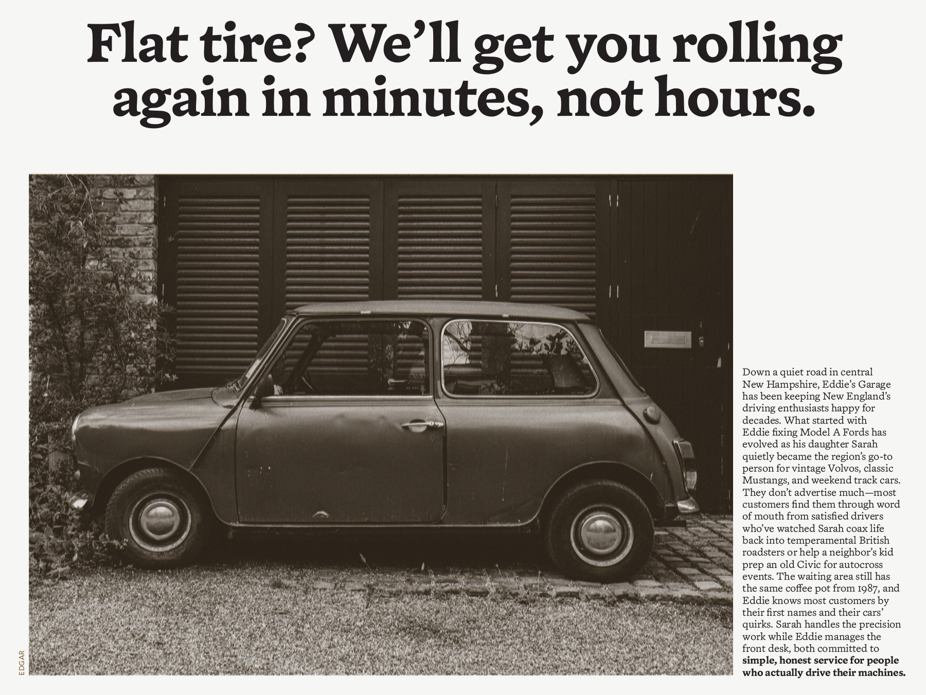
Because type specimens trickily must convey words without actually saying anything, I had to generate blocks of text to work with my layouts, but it also meant that sometimes I could bleed those words right off the edge of the page.
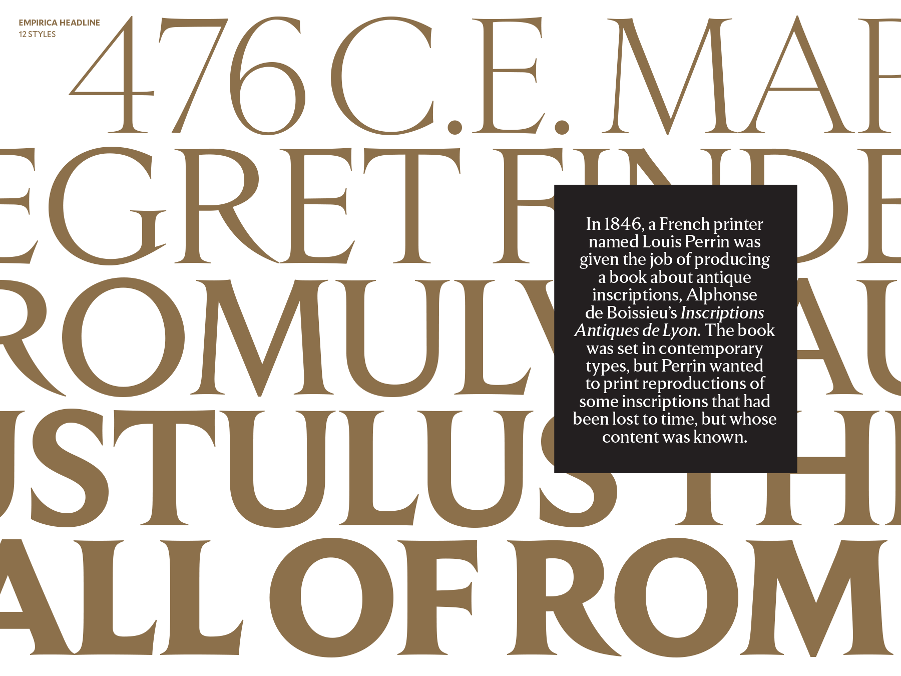
There are too many spreads in this to fully capture the wild variety on offer in Frere-Jones’ catalog. Experience the magic yourself! They’re available for sale on the foundry’s site!
Thanks to Tobias, Christine, Nina and Fred for entrusting me with their beautiful work!