
A bold rebrand for beloved hair care
Rebrands can often be more difficult than the original brand. Change, even when it’s good, is hard. Not Your Mother’s has had wild success, with wide distribution across the U.S. When this beloved hair care brand approached us, they were at a pivotal moment for the company. Its founders were retiring, its new owners expanding, and its customer base was solidly loyal. A careful rethink of the brand identity, along with its brand architecture and packaging system, was due.
The heart of the brand
The identity had served the company well, and had a lot of brand equity for NYM’s loyal customers. Customers could easily recognize products on the shelf, but over time, the brand’s popularity produced copycats, and competitors began using visual elements that were once unique to Not Your Mother’s. This is not an uncommon challenge in the branding world. Trends are real, and sometimes brands must pivot to remain fresh and recognizable.

We maintained as much of the personal touch the brand already communicated as possible, combining hand-drawn elements—specifically, the heart-shaped O in the logo, as well as a cursive ‘nym’ signoff.
In addition to a comprehensive audit of the brand’s architecture, our team began to build a structure that could support existing products, but allow the company to greatly expand its offering. We focused on packaging consistency and benefit, and created a system that read consistently in the tall, vertical format of the products’ container shapes.
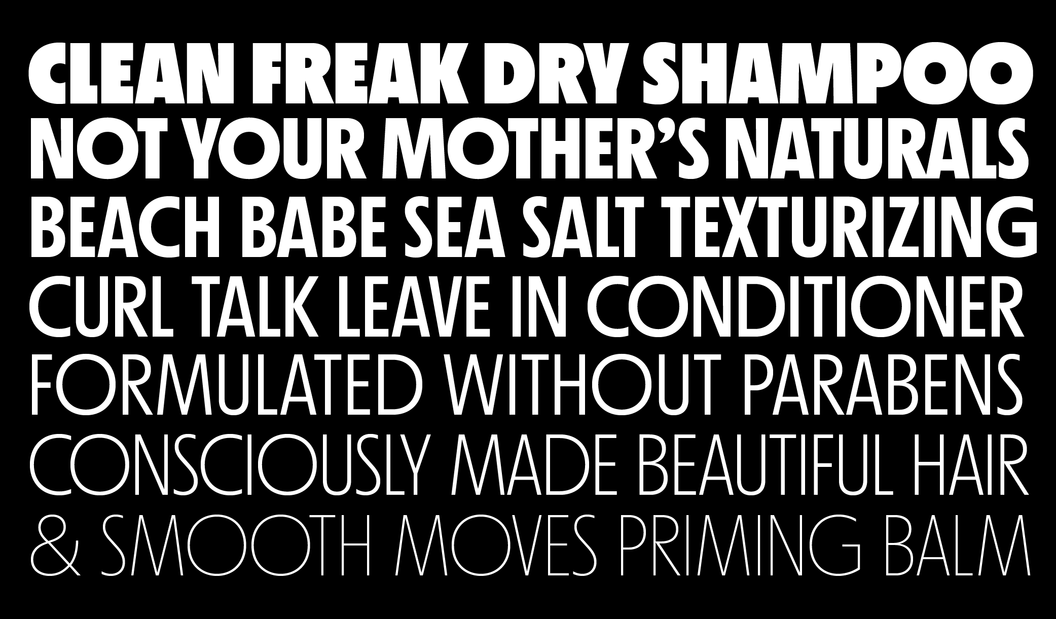
We swapped out most of the typography with Nichrome, a contemporary take on a geometric sans serif with tall, Art Deco proportions, and worked directly with Mass-Driver, the foundry, to customize small details that would help make the type really sing.
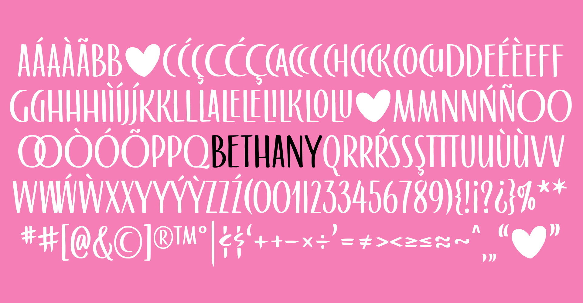
Bethany
The biggest lift (and the most fun!) was designing a custom typeface made from hand-lettering I drew that reflected the proportions of Nichrome. I drew an exhaustive amount of contextual alternates to create snugly-fitting letter pairs. The typeface—named lovingly after the company’s founding matriarch, Bethany—offered the same hand-done texture as the script they’d previously used, but allowed for better fit and clearer legibility.
Real growth
The resulting comprehensive rebrand was informed by a strong brand architecture strategy we developed to understand all the ways they wanted to grow. The company has grown 40% YoY every year since the rebrand, and is now sold in more than 40,000 stores.